About Adaptation
Screen adaptation in iOS development
After Apple officially released the iPhone 6 and iPhone 6 Plus, adaptation issues became a constant headache. Although the project had always used Auto Layout, reading all kinds of adaptation articles online only made things more confusing.
At the time, I summarized a few key points about adaptation:
- Add launch images for iPhone 6 and iPhone 6 Plus, or use a xib as the launch view to avoid automatic scaling.
- Use Auto Layout. Of course, absolute layout is not completely unacceptable.
- Add @3x assets, or use vector images instead (recommended).
One thing worth mentioning is that when using PDF vector images, Xcode converts them into three PNG images during compilation: @1x, @2x, and @3x. In other words, the final app bundle does not contain a PDF file, but these three images instead.
If that is all there is to it, then everything should be fine. But later I found a problem:
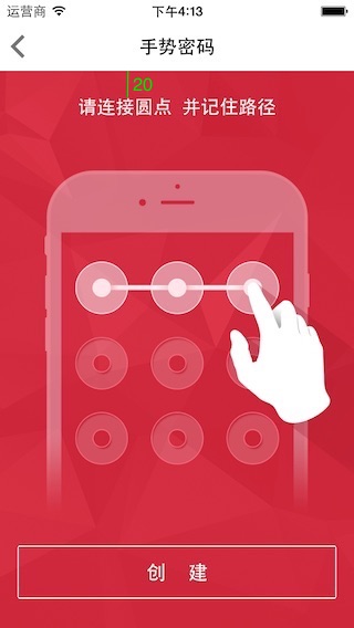
The Label saying “Please connect the dots and remember the path” was originally designed with a top constraint of 20. That works fine on 320 x 480 and 320 x 568 resolutions, but on iPhone 6 and iPhone 6 Plus the entire label appears too close to the top and looks unattractive. The button below has the same problem: it is too close to the bottom.
Based on this problem, I fell into the Size Classes trap. Why do I say that? Look at the figure below: 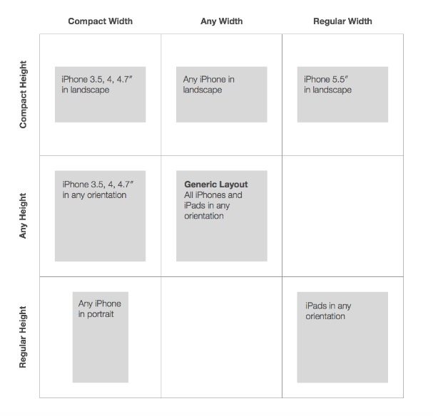
Any height with Compact width corresponds to devices other than the iPhone 6 Plus, while Regular height with Compact width corresponds to all iPhone devices in portrait mode. There is no separate case for iPhone 6 Plus, so this does not solve the problem at all. What I want to say here is that if an app only supports iPhone devices and only in portrait orientation, then there is really no need to use Size Classes.
Looking back, besides the three points mentioned above, what else do we need to solve?
In fact, there is only one issue: handling special screens
Do not rush to criticize this. Please keep reading.
Back to the previous problem: how do we solve it?
- Method 1: detect different devices and set different constraint values. This works for handwritten code.
- Method 2: create several layouts in xib/storyboard. Of course, this only works in xib/storyboard.
- Method 3: use constraint values as a percentage of the screen height. This works for both handwritten code and xib/storyboard.
Let’s focus on method 3. It is easy to do this in handwritten code. But in xib/storyboard, you cannot set a constraint value as a ratio of another view’s height. The solution is shown below:
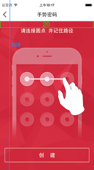
For example, if the designer used the iPhone 5/5s as the design reference and the top label needs a top constraint of 20, then in xib/storyboard you can add a transparent view above the label and set its height to 20. What you need to do is:
- Center the label horizontally and set its top constraint relative to the view to 0.
- Set the view’s left, right, and top constraints relative to its parent view to 0.
- Set the height of the view relative to its parent view, that is,
self.view, to 20:568. The trick is to control-drag from the view toself.viewand chooseEqual Heights, then set theMultipliervalue in the details inspector.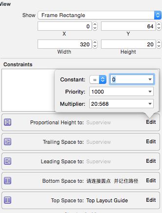
- Finally, click
Update Frames.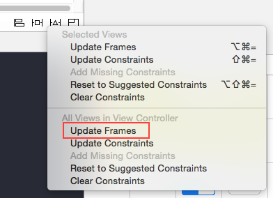
That way, the layout will look good on all screen sizes.
Another layout approach is to make the label a subview of the view and center it both vertically and horizontally, while also setting the height ratio of the view in the same way. This approach is suitable for pages with many controls. 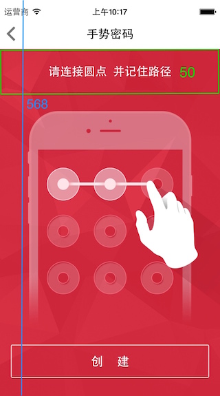
However, using proportional layouts may not be as perfect as manually setting constraints case by case, but it has advantages in complex layouts. The adaptation result for the app’s home page is shown below: 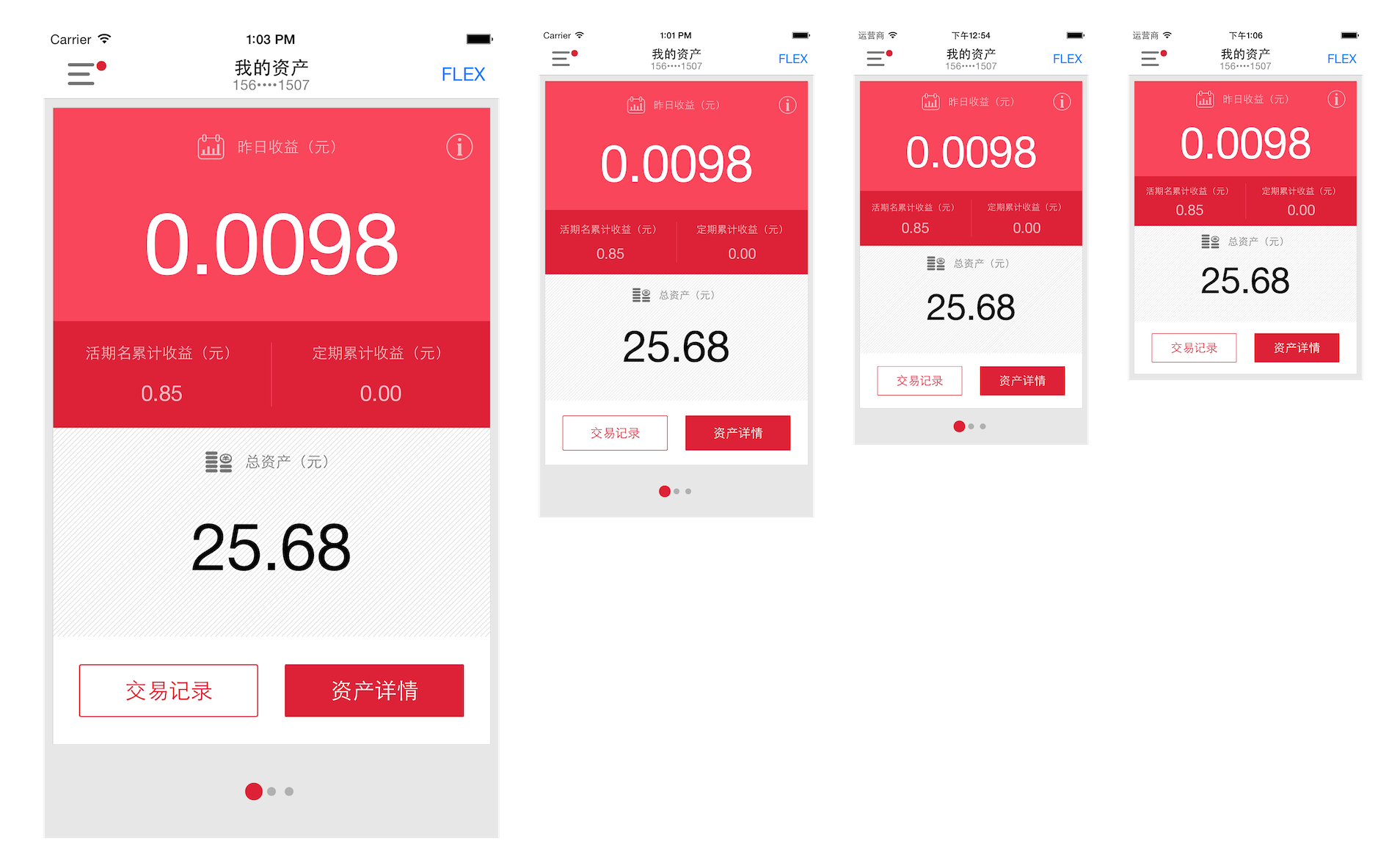 and here is an example of one of the layouts:
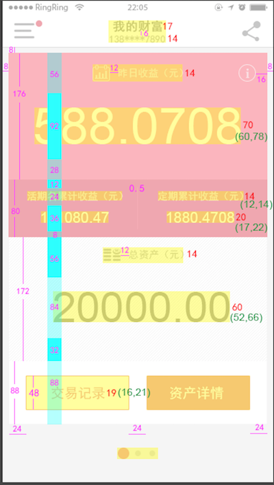
Another example: on this Zhihu question, see Liu Wei’s answer about adapting a profile page. Manually setting the size of an ImageView can also be solved using the proportional layout method described above.