Texture Layout
Texture
Texture has its own mature layout system. Although the learning curve is a bit steep, it is at least more pleasant to write than native AutoLayout, and the key point is that its performance is much better than AutoLayout. The Texture documentation also highlights the advantages of this layout system:
- Fast: As fast as manual layout code and significantly faster than Auto Layout
- Asynchronous & Concurrent: Layouts can be computed on background threads so user interactions are not interrupted.
- Declarative: Layouts are declared with immutable data structures. This makes layout code easier to develop, document, code review, test, debug, profile, and maintain.
- Cacheable: Layout results are immutable data structures so they can be precomputed in the background and cached to increase user perceived performance.
- Extensible: Easy to share code between classes.
First, this layout system is based on Texture components, so when you need to use native controls, wrapping a native component in a block is a very natural approach. For example:
1
2
3
4
5
6
7
8
ASDisplayNode *animationImageNode = [[ASDisplayNode alloc] initWithViewBlock:^UIView * _Nonnull{
    FLAnimatedImageView *animationImageView = [[FLAnimatedImageView alloc] init];
    animationImageView.layer.cornerRadius = 2.0f;
    animationImageView.clipsToBounds = YES;
    return animationImageView;
}];
[self addSubnode:animationImageNode];
self.animationImageNode = animationImageNode;
ASDisplayNode checks whether it has subviews after initialization, and if so it calls
1
- (ASLayoutSpec *)layoutSpecThatFits:(ASSizeRange)constrainedSize
for layout, so you need to override this method to lay out a view. For example:
1
2
3
4
- (ASLayoutSpec *)layoutSpecThatFits:(ASSizeRange)constrainedSize{
    ASInsetLayoutSpec *inset = [ASInsetLayoutSpec insetLayoutSpecWithInsets:UIEdgeInsetsZero child:_childNode];
    return insetLayout;
}
_childNode has zero margins relative to its parent view, which is equivalent to top, bottom, left, and right all being 0 in AutoLayout.
1
2
3
4
5
6
-----------------------------Parent View----------------------------
|  -------------------------_childNode---------------------  |
|  |                                                      |  |
|  |                                                      |  |
|  ---------------------------  ---------------------------  |
--------------------------------------------------------------------
You can see that layoutSpecThatFits: must return an ASLayoutSpec. ASInsetLayoutSpec is one of its subclasses. Below are all the subclasses and their relationships:
- ASLayoutSpec
- ASAbsoluteLayoutSpec // absolute layout
- ASBackgroundLayoutSpec // background layout
- ASInsetLayoutSpec // inset layout
- ASOverlayLayoutSpec // overlay layout
- ASRatioLayoutSpec // ratio layout
- ASRelativeLayoutSpec // corner layout
- ASCenterLayoutSpec // center layout
- ASStackLayoutSpec // stack layout
- ASWrapperLayoutSpec // fill layout
- ASCornerLayoutSpec // badge layout
ASAbsoluteLayoutSpec
The usage is similar to native absolute layout.
1
2
3
4
5
6
7
- (ASLayoutSpec *)layoutSpecThatFits:(ASSizeRange)constrainedSize{
  self.childNode.style.layoutPosition = CGPointMake(100, 100);
  self.childNode.style.preferredLayoutSize = ASLayoutSizeMake(ASDimensionMake(100), ASDimensionMake(100));

  ASAbsoluteLayoutSpec *absoluteLayout = [ASAbsoluteLayoutSpec absoluteLayoutSpecWithChildren:@[self.childNode]];
  return absoluteLayout;
}
The important thing to note is that ASAbsoluteLayoutSpec is generally placed through ASOverlayLayoutSpec or ASBackgroundLayoutSpec, because only those two layouts can preserve the absolute-layout behavior of ASAbsoluteLayoutSpec. For example, if only one control in a view needs ASAbsoluteLayoutSpec, while the rest of the controls use ASStackLayoutSpec (introduced later), then once absoluteLayout is added to ASStackLayoutSpec, it loses its original meaning.
1
ASOverlayLayoutSpec *contentLayout = [ASOverlayLayoutSpec overlayLayoutSpecWithChild:stackLayout overlay:absoluteLayout];
However, the official documentation clearly says this layout style should be used as little as possible:
Absolute layouts are less flexible and harder to maintain than other types of layouts.
ASBackgroundLayoutSpec
1
2
3
4
- (ASLayoutSpec *)layoutSpecThatFits:(ASSizeRange)constrainedSize{
  ASBackgroundLayoutSpec *backgroundLayout = [ASBackgroundLayoutSpec backgroundLayoutSpecWithChild:self.childNodeB background:self.childNodeA];
  return backgroundLayout;
}
Use childNodeA as the background of childNodeB, meaning childNodeB is on top. Note that ASBackgroundLayoutSpec does not actually change the view hierarchy. For example:
1
2
3
4
5
6
7
8
9
ASDisplayNode *childNodeB = [[ASDisplayNode alloc] init];
childNodeB.backgroundColor = [UIColor blueColor];
[self addSubnode:childNodeB];
self.childNodeB = childNodeB;

ASDisplayNode *childNodeA = [[ASDisplayNode alloc] init];
childNodeA.backgroundColor = [UIColor redColor];
[self addSubnode:childNodeA];
self.childNodeA = childNodeA;
Even if you use the layout above, childNodeB is still underneath.
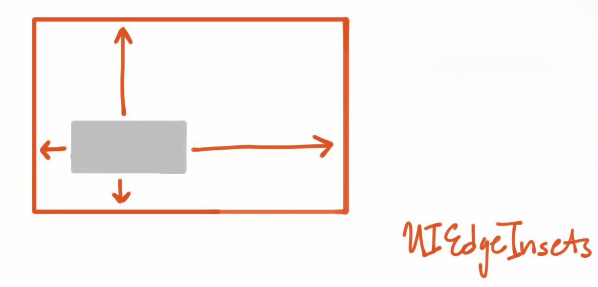
ASInsetLayoutSpec
This is one of the most commonly used classes. The diagram should make it clear at a glance (image from the official documentation)
1
2
3
4
- (ASLayoutSpec *)layoutSpecThatFits:(ASSizeRange)constrainedSize{
    ASInsetLayoutSpec *inset = [ASInsetLayoutSpec insetLayoutSpecWithInsets:UIEdgeInsetsZero child:_childNode];
    return insetLayout;
}
_childNode has zero margins relative to the parent view, which is equivalent to filling the entire parent view. It and ASOverlayLayoutSpec, which will be mentioned later, are mostly used to combine two Elements.
ASOverlayLayoutSpec
See ASBackgroundLayoutSpec.
ASRatioLayoutSpec
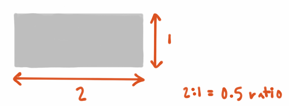
(image from the official documentation)
This is also a commonly used class. Its purpose is to set the aspect ratio of itself, for example to create a square view.
1
2
3
4
- (ASLayoutSpec *)layoutSpecThatFits:(ASSizeRange)constrainedSize{
    ASRatioLayoutSpec *ratioLayout = [ASRatioLayoutSpec ratioLayoutSpecWithRatio:1.0f child:self.childNodeA];
    return ratioLayout;
}
ASRelativeLayoutSpec
Calling it corner layout may not be entirely accurate. In fact, it can place a view at top-left, bottom-left, top-right, and bottom-right, and it can also be set to center layout.
1
2
3
4
5
- (ASLayoutSpec *)layoutSpecThatFits:(ASSizeRange)constrainedSize{
    self.childNodeA.style.preferredSize = CGSizeMake(100, 100);
    ASRelativeLayoutSpec *relativeLayout = [ASRelativeLayoutSpec relativePositionLayoutSpecWithHorizontalPosition:ASRelativeLayoutSpecPositionEnd verticalPosition:ASRelativeLayoutSpecPositionStart sizingOption:ASRelativeLayoutSpecSizingOptionDefault child:self.childNodeA];
    return relativeLayout;
}
The example above places childNodeA in the top-right corner.
ASCenterLayoutSpec
In most cases, it is used to center a view.
1
2
3
4
5
- (ASLayoutSpec *)layoutSpecThatFits:(ASSizeRange)constrainedSize{
    self.childNodeA.style.preferredSize = CGSizeMake(100, 100);
    ASCenterLayoutSpec *relativeLayout = [ASCenterLayoutSpec centerLayoutSpecWithCenteringOptions:ASCenterLayoutSpecCenteringXY sizingOptions:ASCenterLayoutSpecSizingOptionDefault child:self.childNodeA];
    return relativeLayout;
}
ASStackLayoutSpec
This can be considered the most commonly used class, and in terms of functionality it is the closest to AutoLayout. It is called stack layout because it is very similar to CSS Flexbox. For more about Flexbox, you can read Ruan Yifeng’s article.
Let’s look at an example first:
1
2
3
4
5
6
7
8
9
10
- (ASLayoutSpec *)layoutSpecThatFits:(ASSizeRange)constrainedSize{
    self.childNodeA.style.preferredSize = CGSizeMake(100, 100);
    self.childNodeB.style.preferredSize = CGSizeMake(200, 200);
    ASStackLayoutSpec *stackLayout = [ASStackLayoutSpec stackLayoutSpecWithDirection:ASStackLayoutDirectionVertical
                                                                             spacing:12
                                                                      justifyContent:ASStackLayoutJustifyContentStart
                                                                          alignItems:ASStackLayoutAlignItemsStart
                                                                            children:@[self.childNodeA, self.childNodeB]];
    return stackLayout;
}
Here is a brief explanation of each parameter:
direction: the direction of the main axis. There are two options:- Vertical:
ASStackLayoutDirectionVertical - Horizontal:
ASStackLayoutDirectionHorizontal
- Vertical:
spacing: the spacing between views along the main axis. For example, if there are four views, the three gaps between them should all bespacing.justifyContent: the arrangement along the main axis. There are five options:ASStackLayoutJustifyContentStartarrange from start to endASStackLayoutJustifyContentCentercenter the items
ASStackLayoutJustifyContentEndarrange from end to startASStackLayoutJustifyContentSpaceBetweendistributed with no space at the endsASStackLayoutJustifyContentSpaceArounddistributed with space at the ends
alignItems: the arrangement along the cross axis. There are five options:ASStackLayoutAlignItemsStartarrange from start to endASStackLayoutAlignItemsEndarrange from end to start
ASStackLayoutAlignItemsCentercenter the itemsASStackLayoutAlignItemsStretchstretch the itemsASStackLayoutAlignItemsBaselineFirstalign using the first text baseline (only available when the main axis is horizontal)ASStackLayoutAlignItemsBaselineLastalign using the last text baseline (only available when the main axis is horizontal)
children: the views to include. The order of elements in the array also represents their layout order, so this matters.
The main-axis direction is especially important. If the main axis is set to ASStackLayoutDirectionVertical, then the meaning of the justifyContent values becomes:
ASStackLayoutJustifyContentStartarrange from top to bottomASStackLayoutJustifyContentCentercenter the itemsASStackLayoutJustifyContentEndarrange from bottom to topASStackLayoutJustifyContentSpaceBetweendistributed with no space at the endsASStackLayoutJustifyContentSpaceArounddistributed with space at the ends
alignItems then becomes:
ASStackLayoutAlignItemsStartarrange from left to rightASStackLayoutAlignItemsEndarrange from right to leftASStackLayoutAlignItemsCentercenter the itemsASStackLayoutAlignItemsStretchstretch the itemsASStackLayoutAlignItemsBaselineFirstinvalidASStackLayoutAlignItemsBaselineLastinvalid
A layout method for subviews with different spacing will be covered later in the practical examples.
ASWrapperLayoutSpec
Fill the entire view.
1
2
3
4
- (ASLayoutSpec *)layoutSpecThatFits:(ASSizeRange)constrainedSize{
    ASWrapperLayoutSpec *wrapperLayout = [ASWrapperLayoutSpec wrapperWithLayoutElement:self.childNodeA];
    return wrapperLayout;
}
ASCornerLayoutSpec
As the name suggests, ASCornerLayoutSpec is suitable for badge-like layouts.
1
2
3
4
5
override func layoutSpecThatFits(_ constrainedSize: ASSizeRange) -> ASLayoutSpec
{
  let cornerSpec = ASCornerLayoutSpec(child: avatarNode, corner: badgeNode, location: .topRight)
  cornerSpec.offset = CGPoint(x: -3, y: 3)
}
The most important thing to note is that offset is the offset of the control’s center.
Layout in Practice
Example 1
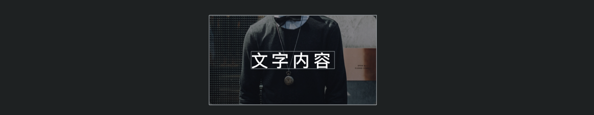
A simple title over an image, with the text centered.
1
2
3
4
5
6
7
- (ASLayoutSpec *)layoutSpecThatFits:(ASSizeRange)constrainedSize{
    ASWrapperLayoutSpec *wrapperLayout = [ASWrapperLayoutSpec wrapperWithLayoutElement:self.coverImageNode];

    ASCenterLayoutSpec *centerSpec = [ASCenterLayoutSpec centerLayoutSpecWithCenteringOptions:ASCenterLayoutSpecCenteringXY sizingOptions:ASCenterLayoutSpecSizingOptionDefault child:self.textNode];
    ASOverlayLayoutSpec *overSpec = [ASOverlayLayoutSpec overlayLayoutSpecWithChild:wrapperLayout overlay:centerSpec];
    return overSpec;
}
ASWrapperLayoutSpecmakes the image fill the entire viewASCenterLayoutSpeccenters the textASOverlayLayoutSpecoverlays the text on the image
Note that the third step is the role mentioned earlier for ASOverlayLayoutSpec / ASBackgroundLayoutSpec: it is used to combine two Elements.
Example 2
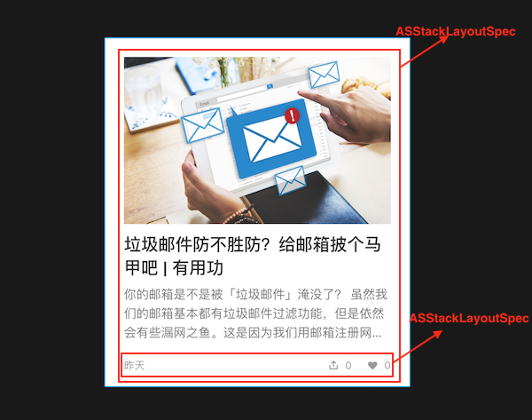
This is the layout of an AppSo channel cell inside the QingMang Reading (Wandoujia Yilan) app. It is also one of the more typical layouts. To make it easier to understand, let’s name the elements from top to bottom and left to right as follows:
- coverImageNode // large image
- titleNode // title
- subTitleNode // subtitle
- dateTextNode // publish time
- shareImageNode // share icon
- shareNumberNode // share count
- likeImageNode // like icon
- likeNumberNode // like count
1
2
3
4
5
6
7
8
9
10
11
12
13
14
15
16
17
18
19
20
21
22
23
24
25
26
27
28
29
30
31
32
33
34
35
36
37
38
39
40
41
42
43
44
45
46
47
48
49
- (ASLayoutSpec *)layoutSpecThatFits:(ASSizeRange)constrainedSize{


    self.shareImageNode.style.preferredSize = CGSizeMake(15, 15);
    self.likeImageNode.style.preferredSize = CGSizeMake(15, 15);

    ASStackLayoutSpec *likeLayout = [ASStackLayoutSpec horizontalStackLayoutSpec];
    likeLayout.spacing = 4.0;
    likeLayout.justifyContent = ASStackLayoutJustifyContentStart;
    likeLayout.alignItems = ASStackLayoutAlignItemsCenter;
    likeLayout.children = @[self.likeImageNode, self.likeNumberNode];

    ASStackLayoutSpec *shareLayout = [ASStackLayoutSpec horizontalStackLayoutSpec];
    shareLayout.spacing = 4.0;
    shareLayout.justifyContent = ASStackLayoutJustifyContentStart;
    shareLayout.alignItems = ASStackLayoutAlignItemsCenter;
    shareLayout.children = @[self.shareImageNode, self.shareNumberNode];

    ASStackLayoutSpec *otherLayout = [ASStackLayoutSpec horizontalStackLayoutSpec];
    otherLayout.spacing = 12.0;
    otherLayout.justifyContent = ASStackLayoutJustifyContentStart;
    otherLayout.alignItems = ASStackLayoutAlignItemsCenter;
    otherLayout.children = @[likeLayout, shareLayout];

    ASStackLayoutSpec *bottomLayout = [ASStackLayoutSpec horizontalStackLayoutSpec];
    bottomLayout.justifyContent = ASStackLayoutJustifyContentSpaceBetween;
    bottomLayout.alignItems = ASStackLayoutAlignItemsCenter;
    bottomLayout.children = @[self.dateTextNode, otherLayout];

    self.titleNode.style.spacingBefore = 12.0f;

    self.subTitleNode.style.spacingBefore = 16.0f;
    self.subTitleNode.style.spacingAfter = 20.0f;

    ASRatioLayoutSpec *rationLayout = [ASRatioLayoutSpec ratioLayoutSpecWithRatio:0.5 child:self.coverImageNode];

    ASStackLayoutSpec *contentLayout = [ASStackLayoutSpec verticalStackLayoutSpec];
    contentLayout.justifyContent = ASStackLayoutJustifyContentStart;
    contentLayout.alignItems = ASStackLayoutAlignItemsStretch;
    contentLayout.children = @[
                               rationLayout,
                               self.titleNode,
                               self.subTitleNode,
                               bottomLayout
                               ];

    ASInsetLayoutSpec *insetLayout = [ASInsetLayoutSpec insetLayoutSpecWithInsets:UIEdgeInsetsMake(16, 16, 16, 16) child:contentLayout];
    return insetLayout;
}
Let’s explain the layout in detail, but first it is important to be clear that Texture follows an inside-out layout principle. That is what makes it easy to use.
- Following the layout principle, first use
ASStackLayoutSpecto lay out theshare iconandshare count, as well as thelike iconandlike count. - Use
ASStackLayoutSpecagain to wrap the two layouts from step 1 and obtain theotherLayoutobject. - Use
ASStackLayoutSpecagain to wrapotherLayoutand thepublish time. Note that here the horizontal alignment is set toASStackLayoutJustifyContentSpaceBetweento achieve edge-to-edge layout, and the final result isbottomLayout. - Since the
large imageis a network image, and for a cell the subview layout determines its height (the cell width defaults to the TableNode width), we must set the image height here.ASRatioLayoutSpecsets the image’s aspect ratio. - Next, the layout should be a vertical stack of
large image,title,subtitle, andbottomLayout. You can see that the spacing between these views is not the same. At this point,spacingBeforeandspacingAfterbecome very useful, because they set the spacing before and after an element along the main axis.self.titleNode.style.spacingBefore = 12.0f;means thetitlehas a spacing of 12 relative to thelarge image. - Finally, use
ASInsetLayoutSpecto set padding.
You can see that not only Node, but ASLayoutSpec itself can also be used as a layout element, because any object that conforms to <ASLayoutElement> can be used as a layout element.
Example 3
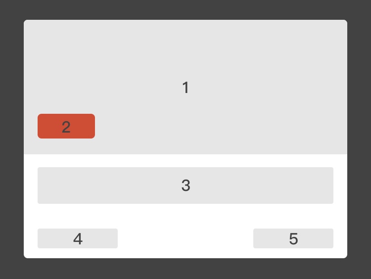
1
2
3
4
5
6
7
8
9
10
11
12
13
14
15
16
17
18
19
20
21
22
23
24
25
26
27
28
29
30
31
32
33
34
35
36
37
38
39
    override func layoutSpecThatFits(_ constrainedSize: ASSizeRange) -> ASLayoutSpec {

        self.node1.style.preferredSize = CGSize(width: constrainedSize.max.width, height: 136)


        self.node2.style.preferredSize = CGSize(width: 58, height: 25)
        self.node2.style.layoutPosition = CGPoint(x: 14.0, y: 95.0)

        self.node3.style.height = ASDimensionMake(37.0)
        self.node4.style.preferredSize = CGSize(width: 80, height: 20)
        self.node5.style.preferredSize = CGSize(width: 80, height: 20)

        self.node4.style.spacingBefore = 14.0
        self.node5.style.spacingAfter = 14.0

        let absoluteLayout = ASAbsoluteLayoutSpec(children: [self.node2])

        let overlyLayout = ASOverlayLayoutSpec(child: self.node1, overlay: absoluteLayout)

        let insetLayout = ASInsetLayoutSpec(insets: UIEdgeInsetsMake(0, 14, 0, 14), child: self.node3)
        insetLayout.style.spacingBefore = 13.0
        insetLayout.style.spacingAfter = 25.0


        let bottomLayout = ASStackLayoutSpec.horizontal()
        bottomLayout.justifyContent = .spaceBetween
        bottomLayout.alignItems = .start
        bottomLayout.children = [self.node4, self.node5]
        bottomLayout.style.spacingAfter = 10.0
//        bottomLayout.style.width = ASDimensionMake(constrainedSize.max.width)


        let stackLayout = ASStackLayoutSpec.vertical()
        stackLayout.justifyContent = .start
        stackLayout.alignItems = .stretch
        stackLayout.children = [overlyLayout, insetLayout, bottomLayout]

        return stackLayout
    }
To demonstrate ASAbsoluteLayoutSpec, here we use it for node3.
Key points:
- Both nodes and layout specs can set the
styleproperty, because they both conform toASLayoutElement - When
spaceBetweendoes not achieve the desired edge-to-edge alignment, try setting the current layout spec’swidth(as shown in the comment) or thealignItemsof its parent layout object. In this example, that isstackLayout.alignItems = .stretch ASAbsoluteLayoutSpecmust have an anchor point, unless the entire layout is absolute. In this example, the anchor point forASAbsoluteLayoutSpecisASOverlayLayoutSpec
Example 4
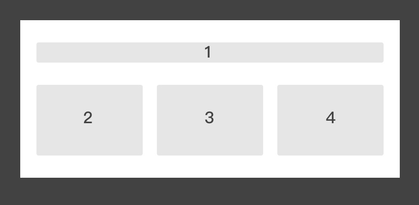
This example is mainly used to demonstrate flexGrow. First, let’s introduce what flexGrow does (from the Jianshu article Nine-Color Platter):
This property controls how child elements allocate the remaining space of the parent when the parent is wider than the total width of all child elements.
The default value of flex-grow is 0, which means the element does not claim any of the parent’s remaining space. If the value is greater than 0, the element does claim it. The larger the value, the more remaining space it claims. For example:
Suppose the parent is 400px wide, and there are two child elements A and B. A is 100px wide and B is 200px wide, so the remaining space is 400 - (100 + 200) = 100px.
If neither A nor B claims the remaining space, then there is 100px of empty space.
If A claims the remaining space and flex-grow is set to 1 while B does not claim any, then the final size of A is its own width (100px) + the remaining space (100px) = 200px.
If both A and B claim the remaining space, with A’s flex-grow set to 1 and B’s set to 2, then the final size of A is its own width (100px) + the remaining space it receives (100px * (1/(1+2))), and the final size of B is its own width (200px) + the remaining space it receives (100px * (2/(1+2))).
1
2
3
4
5
6
7
8
9
10
11
12
13
14
15
16
17
18
19
20
21
22
23
24
25
     override func layoutSpecThatFits(_ constrainedSize: ASSizeRange) -> ASLayoutSpec {

        self.node1.style.height = ASDimensionMake(20.0)
        var imageLayoutArray = [ASLayoutElement]()

        [self.node2, self.node3, self.node4].forEach { (node) in
            let layout = ASRatioLayoutSpec(ratio: 2.0/3.0, child: node)
            layout.style.flexGrow = 1 // equivalent to equal widths
            imageLayoutArray.append(layout)
        }

        let imageLayout = ASStackLayoutSpec.horizontal()
        imageLayout.justifyContent = .start
        imageLayout.alignItems = .start
        imageLayout.spacing = 14.0
        imageLayout.children = imageLayoutArray

        let contentLayout = ASStackLayoutSpec.vertical()
        contentLayout.justifyContent = .start
        contentLayout.alignItems = .stretch
        contentLayout.spacing = 22.0
        contentLayout.children = [self.node1, imageLayout]

        return ASInsetLayoutSpec(insets: UIEdgeInsetsMake(22.0, 16.0, 22.0, 16.0), child: contentLayout)
    }
In this example, the total width of node2, node3, and node4 is smaller than the parent width. So to make them the same width, we only need to set the same flexGrow value for all three (all 1), and then use ASRatioLayoutSpec to fix each aspect ratio. That way, the final width of these three controls is determined.
Example 5
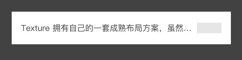
This example is mainly used to demonstrate flexShrink. It also draws from the Jianshu article Nine-Color Platter for the explanation of flexShrink:
This property controls how child elements shrink their width when the parent is narrower than the total width of all child elements.
The default value of flex-shrink is 1. When the parent width is smaller than the sum of all child widths, the child widths will shrink. The larger the value, the more they shrink. If the value is 0, they do not shrink.
For example: the parent is 400px wide, and there are two child elements A and B. A is 200px wide and B is 300px wide. Then the total overflow is (200 + 300) - 400 = 100px.
If neither A nor B shrinks, that is, both have flex-shrink set to 0, then 100px will overflow the parent. If A does not shrink, with flex-shrink set to 0 and B does shrink, then the final size of B is its own width (300px) - the total overflow (100px) = 200px. If both A and B shrink, with A’s flex-shrink set to 3 and B’s set to 2, then the final size of A is its own width (200px) - the amount it shrinks (100px * (200px * 3/(200 * 3 + 300 * 2))) = 150px, and the final size of B is its own width (300px) - the amount it shrinks (100px * (300px * 2/(200 * 3 + 300 * 2))) = 250px.
At present, the most common use of this property is limiting text width. In the image above, textNode and displayNode are aligned at both ends, and the text’s maximum width needs to be constrained. In that case, setting flexShrink is the most convenient approach.
1
2
3
4
5
6
7
8
9
10
11
12
13
14
override func layoutSpecThatFits(_ constrainedSize: ASSizeRange) -> ASLayoutSpec {
        self.displayNode.style.preferredSize = CGSize(width: 42.0, height: 18.0)
        self.textNode.style.flexShrink = 1

        let contentLayout = ASStackLayoutSpec.horizontal()
        contentLayout.justifyContent = .spaceBetween
        contentLayout.alignItems = .start
        contentLayout.children = [self.textNode, self.displayNode]

        let insetLayout = ASInsetLayoutSpec(insets: UIEdgeInsetsMake(16.0, 16.0, 16.0, 16.0), child: contentLayout)

        return insetLayout

    }
As a side note, if ASTextNode shows unexplained text truncation issues, you can use ASTextNode2 instead.
Example 6
A fairly typical example.
1
2
3
4
5
6
7
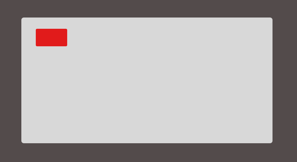
override func layoutSpecThatFits(_ constrainedSize: ASSizeRange) -> ASLayoutSpec {
let otherLayout = ASInsetLayoutSpec(insets: UIEdgeInsetsMake(10.0, 10.0, CGFloat(Float.infinity), CGFloat(Float.infinity)), child: topLeftNode)
let contentLayout = ASOverlayLayoutSpec(child: coverImageNode, overlay: otherLayout)
return contentLayout
}
Using ASInsetLayoutSpec is the best solution. It is worth noting that for the red control, you only need to set the top and left spacing; the other directions can be replaced with CGFloat(Float.infinity) and do not need specific values.
Finally, the examples above have been uploaded to TextureLayoutDemo.